Studio Philosophy / Methodology
Design Rooted in Specificity
We reject the idea of a generic "global aesthetic." Our process begins with the constraints of a place, a brand's history, and a user's immediate goal. The result isn't just a website—it's a considered digital environment that feels inevitable.
Explore Our Process“We build from the ground up, not from a template down. Every line of code and every pixel is justified by the specific problem we’re solving.”
The Bogotá Anchor
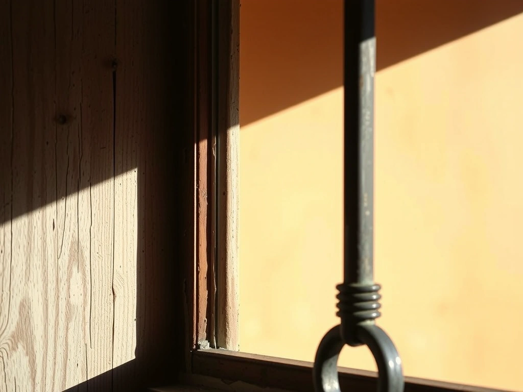
Our studio sits in Usaquén, where colonial brick meets modernist glass. This physical juxtaposition directly informs our grid systems. We don't use arbitrary spacing; the gutter width in our 12-column system is calculated from the spacing between colonial window frames—a subtle, tactile rhythm.
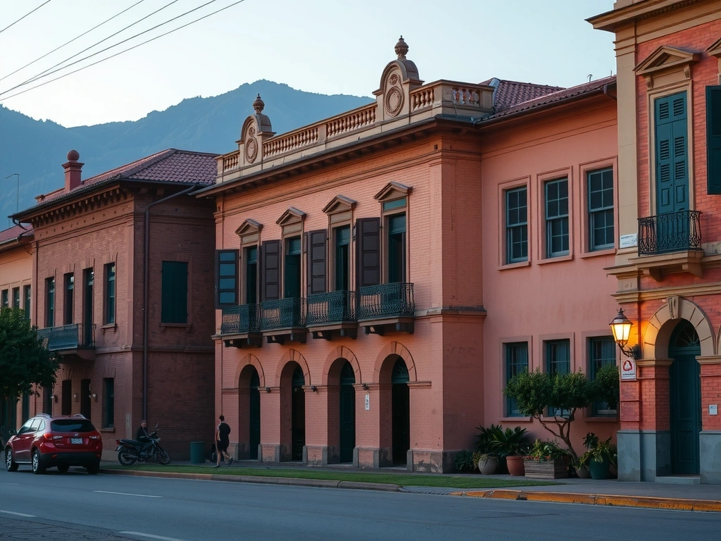
Source Palette
Terracotta & Indigo from local markets
Grid Foundation
Window frame spacing dictates gutter width
The Translation Layer
We systematically translate client goals into interface decisions. It’s a three-stage process focused on clarity, not ambiguity.
Deconstructing the Brief
We extract three core verbs from your goal (e.g., 'educate,' 'convert,' 'retain').
Example: A non-profit's goal is "educate." The verb becomes the lens for every design decision. The primary navigation is "Learn," the color palette is educational (calm blues), and the imagery is documentary-style. The hero section leads with a quiz, not a carousel.
The 'Why' Ladder
For every proposed feature, we ask "Why?" five times to ensure it serves the core verb.
Scenario: Client requests a homepage video. First "Why?": "To show our process." Second "Why?": "To build trust." Third "Why?": "Because users don't understand us." A testimonial carousel with client quotes achieves the same goal with 90% less development complexity and 50% faster load time.
Component Mapping
We build a design system where each component is tagged with the verb it supports.
Outcome: The 'Get Involved' button is tagged with "convert." The 'Success Story' card is tagged with "educate." This creates a coherent system that scales. If a new feature is proposed, we ask: "Which verb does it serve?" If none, it's cut.
The Decision Lens: Criteria & Trade-offs
Every design choice runs through this filter. It’s how we balance ambition with reality.
Clarity of Intent
Does this solve the user's core verb?
Maintainability
Can the client update this without our help?
Performance
Does it meet our 1.5s load time on 3G constraint?
Studio Glossary: Terms We Use With Intention
Intent-First
Our View: Not a buzzword. It means we define "why" a user visits before we design "what" they see. The rest follows.
Constraint as Catalyst
Our View: The best ideas emerge under restriction. A 1.5s load time forces clarity. A limited budget sparks creativity.
Fidelity
Our View: Three stages only. Concept (paper), Structure (wireframe), Polish (prototype). We never jump stages—it creates ambiguity.
The 'Why' Ladder
Our View: A rigor, not a formality. Asking "why?" five times separates user needs from stakeholder opinions.
Inevitability
Our View: The final metric. A successful project feels like it could have been built no other way. It’s not an aesthetic; it’s the result of a rigorous process.
The Crelino Commitment
You receive more than deliverables. You receive a documented methodology and a partner committed to your long-term success.
Design Rationale PDF
A 5-page document explaining every major decision and its link to your goals.
Living Style Guide
Includes code snippets. We hand over the system, not just the screens.
30-Day Post-Launch Check-in
We review analytics and user feedback to suggest one high-impact refinement.
What We Need From You
- ✓ Clear access to your users for interviews and testing.
- ✓ Honest feedback, even when it challenges the design.
- ✓ A commitment to the 8-12 week process for the best outcome.
"We will challenge your assumptions. Our job is to build what works, not what was first requested."